Css Color Choosing
Contents
A new approach to one of my biggest design weaknesses, using basic color theory, HSL, and Sass.
In my work as a designer, color has never been my strong suit. I often try to avoid dealing with it entirely (as seen in the previous version of my site). Through education and experience, I’ve picked up the basics of color theory and mostly avoided catastrophe, but my rudimentary process has been anything but reliable.
My V6 redesign seemed like a good opportunity to try to improve my color game, since my site is meant to represent me, and I like to think I have a colorful personality. To really make the exercise count, rather than creating one color scheme, I wanted to create a system to which I could apply any number of color schemes. This would give me a space to experiment with color on an ongoing basis, and ideally it would accommodate a range of complexity, giving me room to grow as my skills improve.
Working out the contrast
The first steps of my color process are unchanged: solidifying the layout in binary black and white before layering in more nuanced contrast in grayscale.
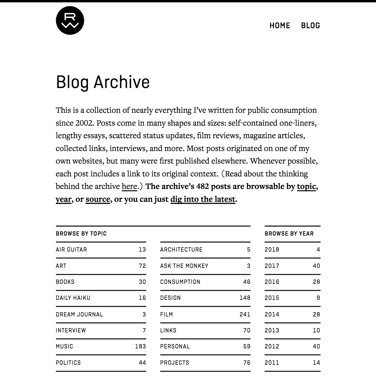
Beginning with black and white lets me focus on the foundational contrast between the layout elements: size, shape, position.
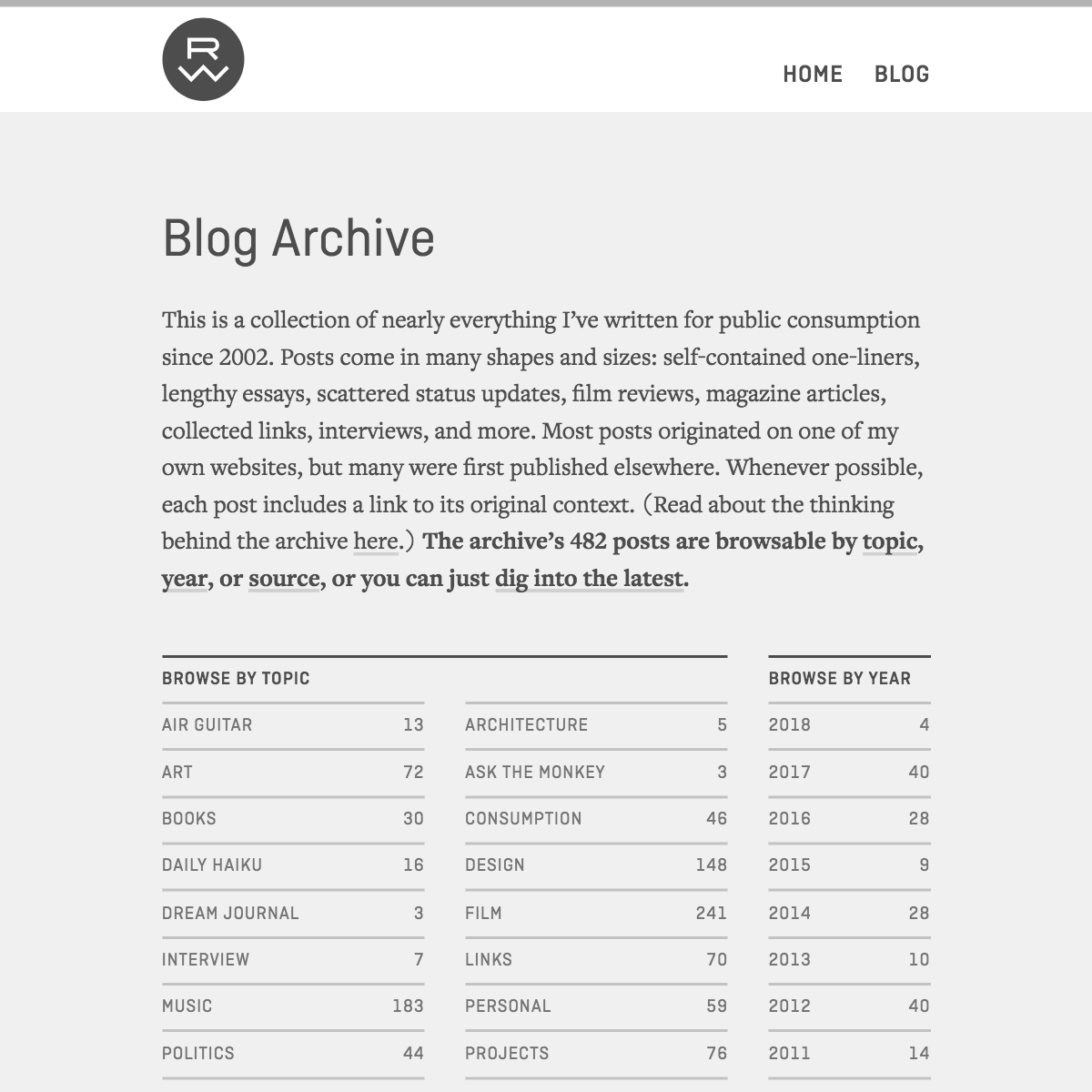
When everything is in place, grayscale values add another dimension of contrast.
Once I have the contrast in a good place, I can extrapolate a palette upon which to map colors. My grayscale contrast work produced these six values:
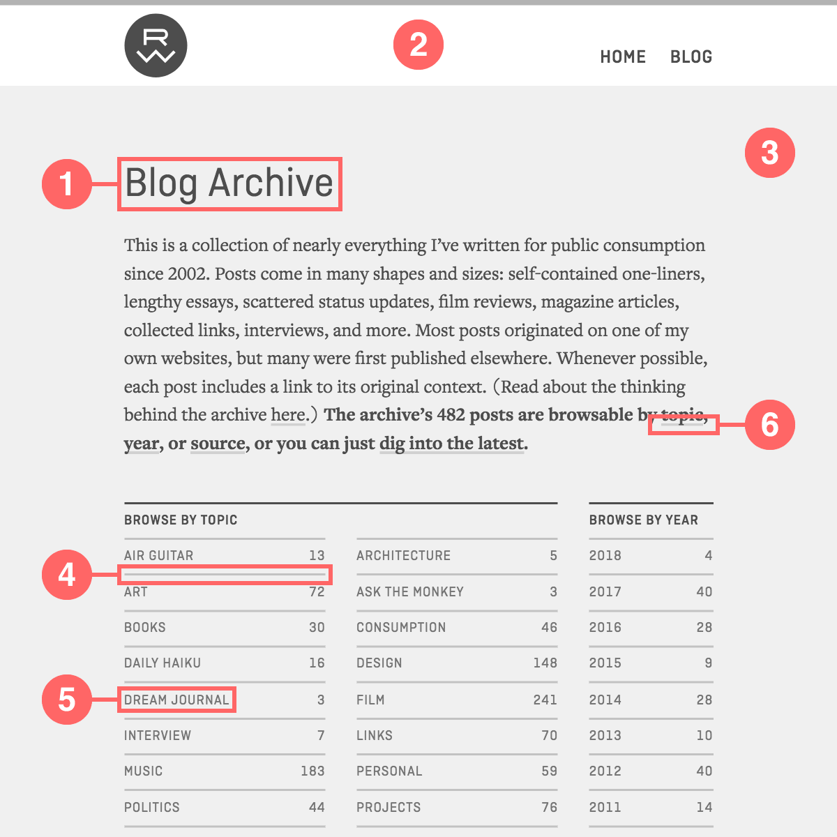
Like the typography and layout, the color palette is determined by the site’s actual content, rather than being devised in a vacuum and retrofitted onto the content.
- Text (70% gray): The darkest color in the palette.
- Text Inverse (white): The lightest color in the palette. For now, this is always white, and its neutrality makes it useful for framing images, isolating their colors from mine.
- Background (6% gray): The second-lightest color in the palette. Dark enough that white can be easily distinguished from it, but light enough that it appears almost white on its own.
- Background Alt (24% gray): Slightly darker than Background. Used mainly for borders and other non-text interface elements.
- Accent 1 (54% gray): Bright hue that contrasts significantly with both Text and Background. Used mainly for metadata.
- Accent 2 (30% gray): Typically the palette’s most distinct and saturated color, used sparingly for inline links and other bits that need to really pop.
We’ll get back to these specific values a bit later.
Color selection
There are two ways to begin developing a palette for a project: find an existing one or create one from scratch. Finding an existing one is simply a matter of keeping your eyes open. I tend to find the most inspiration in painting, sculpture, illustration, photography, and other visual arts. Colossal is one of my most reliable resources.

I maintain a collection of images that catch my eye (credits listed below; see a larger version here).
Palettes devised from the dominant colors of those collected images.
When creating a palette from scratch, I’ve long relied on the historical RYB color wheel, which posits that red, yellow, and blue are the primary colors from which all other basic colors are derived. Modern color theory is more sophisticated, which we’ll get to shortly, but the RYB color wheel was wired into my brain at an early age, and I still find it useful. Here are some color wheel concepts worth considering when assembling a palette:
The RYB color wheel shows the relationship between primary colors (1), secondary colors (2), and tertiary colors (3).
- Red, yellow, and blue are the primary colors.
- A secondary color is an even combination of any two primaries: yellow plus red equals orange, red plus blue equals violet, blue plus yellow equals green.
- A tertiary color is an even combination of a primary and an adjacent secondary: yellow-orange, orange-red, red-violet, violet-blue, blue-green, green-yellow.
- In theory, the purest color pairings are evenly spaced on the wheel, such as complementary colors (opposite each other on the wheel) and triads (a set of three colors forming an equilateral triangle).
- Otherwise, owing to the ratio of primaries in their makeup, colors pair well with others in their category: primaries with primaries (0:1), secondaries with secondaries (1:1), and tertiaries with tertiaries (2:1).
Harmonious color wheel combinations based on the principles described above. From left to right: two complementary colors, the triad of secondaries, and a selection of four tertiaries (which also happens to be two pairs of complements).
Color implementation and adjustment
Finding a basis for a palette is easy enough, but getting that basic palette to work with a design is rarely a mere matter of transference, and this is where I usually get into trouble. Two of color’s biggest stumbling blocks for me have always been implementation and adjustment. “I like this yellow, but it’s not working as a background color. How do I fix it?” Adjusting colors digitally with sliders, color pickers, and hand-coded hex values left me flailing. I couldn’t find a method to the madness. And implementing and tweaking them across a larger design system (whether in mockups or code) tended to be an onerous task.
Thankfully, technology exists to address those issues, and my newly emboldened attitude about color was made possible by two technologies that are relatively new to me: HSL and Sass. For color adjustment, HSL brings a level of granular control to the process that other color systems lack. And for implementation, Sass lets me assign color values to variables, which make system-wide iteration quick and painless.
Color adjustment: HSL
The RYB color wheel we went over earlier is intended for mixing paint, ink, dye, etc. It’s a _subtractive color_ model, which means that its colors are made visible by subtracting wavelengths from light. Modern color theory has found a broader spectrum of colors in a subtractive model with slightly different primary colors: cyan, magenta, and yellow. These are the basis of CMYK (the K stands for blacK), the process behind most of the full-color printed material you see. Its inverse is the _additive color_ model, RGB, whose primaries are red, green, and blue. This is the basis of color projected in light, as seen on the screens of our TVs, computers, and mobile devices.
CMY (subtractive) color mixing.
RGB (additive) color mixing.
HSL is a representation of the RGB color model. It was invented in 1938 in anticipation of color television, but it didn’t find its way into CSS—where it would ultimately be most useful to me—until 2011. HSL stands for hue, saturation, lightness, which are the foundational attributes of color, which I didn’t really understand until recently. (A similar system, HSB, has long been available in most design software, but I sadly never pondered how it worked or what it might have to offer.) Here’s a quick rundown of the nuts and bolts of HSL:
The RGB color wheel. Red (0º), green (120º), and blue (240º) are the primary hues.
Saturation (top) defines how vivid the color is. Lightness (bottom) defines how much black or white the color has in it.
- Hue defines the basic color. “Light green,” “dark green,” “bright green,” and “dull green” are all just variations on green, right? So in all those colors, green is the hue. In HSL, a hue is defined by a number between 0 and 360, so it’s useful to envision the hue spectrum radially. HSL uses the RGB color wheel shown above.
- Saturation defines how vivid the color is. Zero percent is gray and 100 percent is fully saturated.
- Lightness defines how much black (shade) or white (tint) the color has in it. 50 percent has no shade or tint, zero percent is fully black, and 100 percent is fully white.
Here’s what HSL syntax looks like in CSS (this is a turquoise, with a 175-degree hue, 100 percent saturation, and 25 percent lightness):
hsl( 175, 100%, 25% )
I find HSL enormously liberating. Historical color wheel concepts map directly to the 360-degree hue system, and HSL’s three foundational attributes let me create and fine-tune color directly in code like never before. Let’s take a look at how I’m using it with Sass.
Color implementation: Sass
The first step of implementation is to make Sass variables out of the site’s six grayscale values I determined earlier. Rather than doing the mental gymnastics of figuring out how those specific grays are expressed in hexadecimal or RGB, I’ll just use Sass’s built-in darken() function:
    $text-color: darken( white, 70% );    // 70% gray
    $text-color-inverse: white;           //  0% gray
    $bg-color: darken( white, 6% );       //  6% gray
    $bg-color-alt: darken( white, 24% );  // 24% gray
    $accent-color1: darken( white, 54% ); // 54% gray
    $accent-color2: darken( white, 30% ); // 30% gray
If I use one of those six variables every time I specify a color in my CSS…
article {
  color: $text-color;
  background-color: $bg-color;
}

footer {
  color: $bg-color-alt;
  background-color: $text-color;
}
…I can easily make changes to the color scheme across the entire site by adjusting just those six variables!
Let’s put it to the test with a palette found in the wild. To ease into things, I chose a palette that looks like it’ll adapt to my system without needing a lot of adjustment.
I’ll grab the dominant colors using the eyedropper tool in Photoshop or Illustrator. Those apps don’t natively support HSL, though, so I’ll convert the colors’ hex values to HSL using Convert a Color, and then plug them into my variables:
$text-color: hsl( 321, 14%, 44% );    // Pale purple
$text-color-inverse: white;           // White
$bg-color: hsl( 45, 50%, 89% );       // Light tan
$bg-color-alt: hsl( 31, 24%, 63% );   // Pale brown
$accent-color1: $bg-color-alt;        // Pale brown
$accent-color2: hsl( 348, 68%, 58% ); // Pale red

The original grayscale values for comparison.
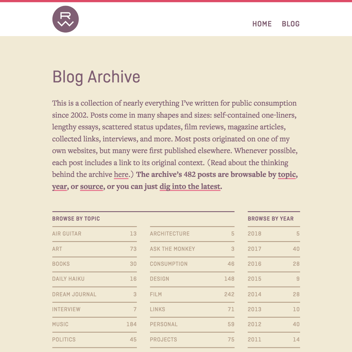
Change a few variables, get a whole new color palette!
This is off to a pretty good start! Right away, I can tell that $bg-color and $bg-color-alt need to be lighter. Also, $accent-color-1 will need to be darker, and since it’s based on another variable, I can accomplish that by making use of the darken() function again. (Note that all darken() does is move HSL’s lightness attribute a specified amount toward zero.) It doesn’t take much tweaking to get things where I want them:
$text-color: hsl( 321, 14%, 44% );
$text-color-inverse: white;
$bg-color: hsl( 45, 50%, 94% );               // +05% lightness
$bg-color-alt: hsl( 31, 24%, 88% );           // +25% lightness
$accent-color1: darken( $bg-color-alt, 25% );
$accent-color2: hsl( 348, 78%, 68% );         // +10% saturation, +10% lightness

Initially, the transplanted palette doesn’t quite work.
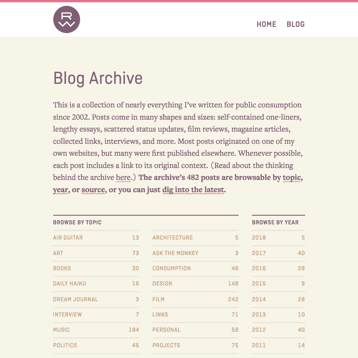
After a few adjustments, it does!
Words can’t express how thrilling it is to be able to make these kinds of color adjustments so intuitively in code. But wait, it gets even better. Let’s try something a bit more adventurous.
If you read this series’ previous post about typography and proportions, you know I like having a rational basis for design decisions, and I like the components of a system to relate to each other in specific ways. Just as my typographic scale is built on numeric intervals, so are the color wheel principles we looked at earlier. And just as my type sizes are all relative to one base value, my colors can be too.
So I’m going to build a palette from scratch using a triad, which is three equidistant hues on the color wheel. In HSL, that means the three colors’ hue attributes will be 120 degrees away from each other. Since this is a predictable interval, I’ll choose a base hue and let Sass figure out what the other two hues should be. Remember how darken() adjusts a color’s lightness? adjust-hue() does the same for the hue. I’ve decided $accent-color2 will be my base color, so it’ll move to the top of the variable list. I’ll give it a red-orange hue (19 degrees), and use adjust-hue() to give the other variables the appropriate chromatic distance:
$accent-color2: hsl( 19, 100%, 50% );
$text-color: adjust-hue( $accent-color2, -120deg );
$text-color-inverse: white;
$bg-color: adjust-hue( $accent-color2, 120deg );
$bg-color-alt: darken( $bg-color, 15% );
$accent-color1: $bg-color-alt;
I’m making a palette from scratch based on this triad.
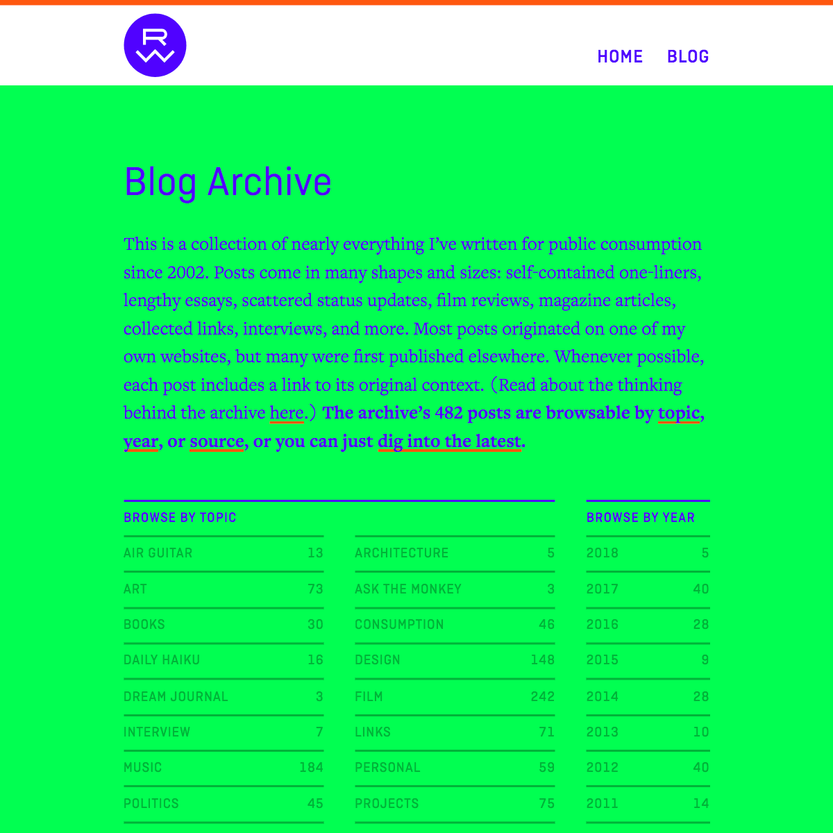
Aaaaaand some adjustments will be necessary.
This palette is clearly going to need more work than the previous one did, but I’ve got some excellent tools at my disposal. darken() and adjust-hue() are great for adjusting a single color attribute, but if I want to adjust multiple attributes at a time, adjust-color() is the way to go:
$accent-color2: hsl( 19, 95%, 60% );
$text-color: adjust-color( $accent-color2, $hue: -120deg, $saturation: -82, $lightness: -18 );
$text-color-inverse: white;
$bg-color: adjust-color( $accent-color2, $hue: 120deg, $saturation: -84, $lightness: 35 );
$bg-color-alt: darken( $bg-color, 10% );
$accent-color1: adjust-color( $bg-color, $saturation: 12, $lightness: -35 );

Before adjustments.
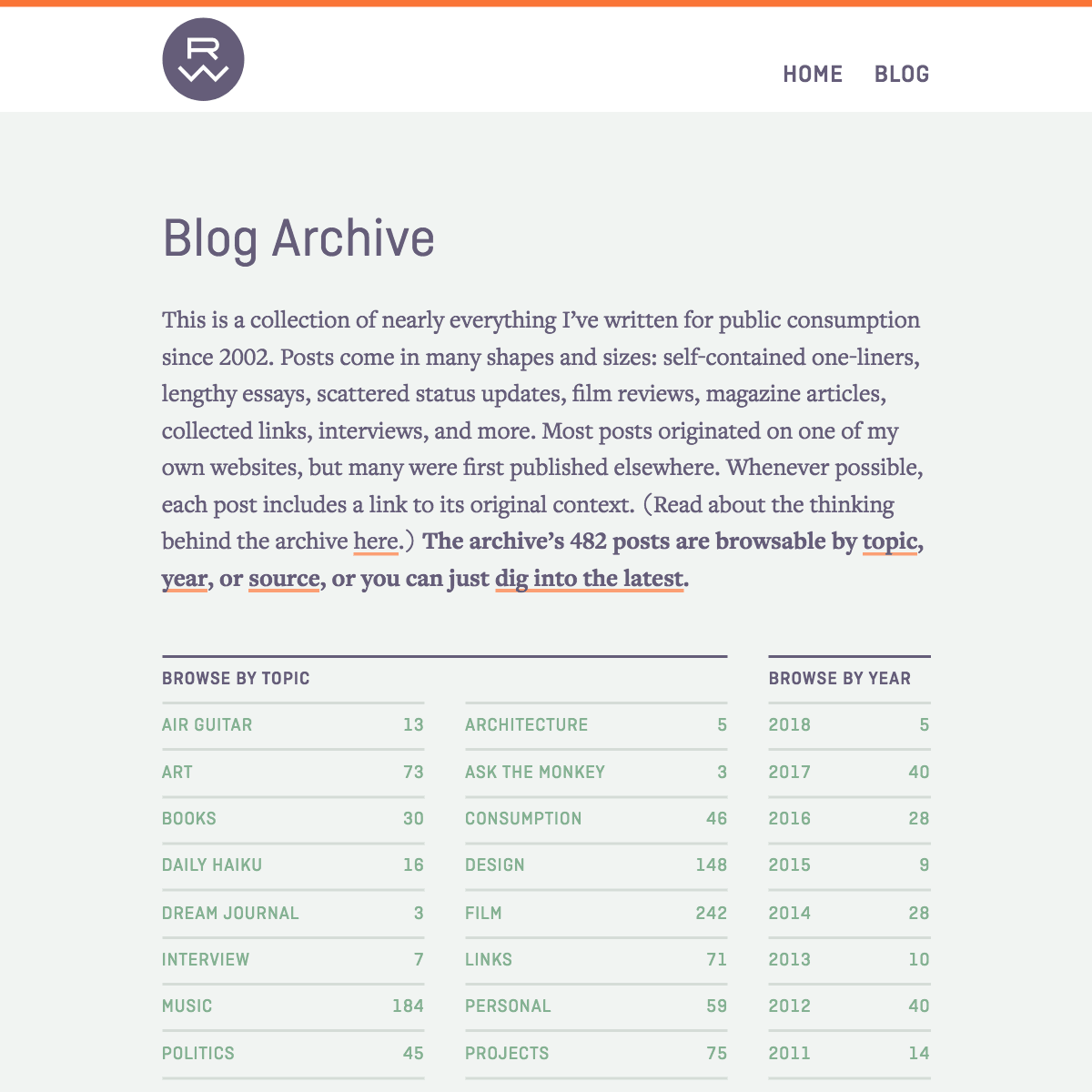
After adjustments.
With all the colors in this palette set up to be relative to $accent-color2, I can now shift the entire color scheme by adjusting that one variable. Below are a few variations, each of which rotates the previous hue by 90 degrees. This final demonstration uses the homepage, which makes the color differences between the examples more pronounced.

$accent-color2: hsl( 19, 95%, 60% );

$accent-color2: hsl( 109, 95%, 60% );

$accent-color2: hsl( 199, 95%, 60% );

$accent-color2: hsl( 289, 95%, 60% );
These will all need individual adjustments (if they can be made to work at all), but hopefully this makes the point that a fairly uncomplicated combination of HSL and Sass can be hugely helpful in color experimentation and iteration.
Randomization
Now that I have a good system in place for experimenting with color, I don’t want to limit my site to just one color scheme. So I’ve put together a file called “color-override.scss” which duplicates every single rule that specifies a color in my main SCSS file—remember, all those rules use my color palette’s Sass variables. Then, when I want to make a new color scheme for the site, I use this template:
$text-color:
$text-color-inverse:
$bg-color:
$bg-color-alt:
$accent-color1:
$accent-color2:

@import "color-override";
The exported CSS file, a fresh color scheme that overrides the main CSS file’s colors, is then added to this inline script’s colorSchemes array in my document head:
Users with JavaScript enabled now get a random color scheme every time the page is loaded or refreshed!
Conclusion
There is still much to learn. I’ve got a ways to go before I’ll feel like I really know what I’m doing with color, but speaking as someone who’s struggled with it for decades, the methodologies described in this post feel like a big leap forward. Whether or not it’s a leap for you, I hope you find something valuable to take away from it.
This is the final post in a series about my site’s 2017 redesign. If you haven’t already, check out the other posts in the series, which discuss the design’s archival philosophy and approach to typography and layout.
Resources
Credits for the collected images above, arranged by row:
- Eiko Ojala, Jiyong Lee, Fabienne Rivory, DKNG, Vincent Mahé
- Markus Reugels, Damian Correll, Bing Wright, Aakash Nihalani, László Moholy-Nagy
- Javier de Riba, Geoffroy Amelot, Matthew Chambers, Maud Vantours, Pawel Nolbert
- Maja Wronska, Alexander Semenov, Bobby McKenna, David Orias, Mat Lucas
- Below the Boat, Samantha Keely Smith, Jimmy Kong, Peter Mendelsund, Jordan Eagles


